By default, the N-genius Hosted Session SDK displays labels inside the card input fields as placeholders. While this keeps the layout compact, some merchants may prefer labels to appear above each field for accessibility or visual clarity.
This guide shows you how to enable floating labels above the card input fields using a single style flag.
Before (Default SDK Layout)
The default Hosted Session fields display placeholder text inside the input boxes, like:
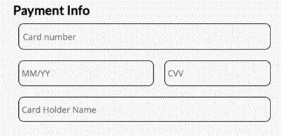
Placeholder Text Inside
After (With Labels Above)
When the showInputsLabel flag is set to true, labels are shown above each input box instead:
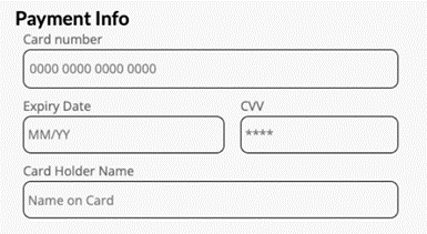
Placeholder Text Above
How to Enable Labels Above Inputs
To switch to this layout, simply add the showInputsLabel: true flag inside the style object when calling mountCardInput.
const style = {
  main: {},     // Style for wrapper div
  base: {},     // Base styles
  input: {},    // Input field styling
  invalid: {},  // Invalid state styling

  // NEW: Show labels above the input fields
  showInputsLabel: true
};

window.NI.mountCardInput('mount-id', {
  apiKey: 'HOSTED_SESSION_API_KEY',
  outletRef: 'YOUR_OUTLET_REFERENCE',
  style,
  language: 'en',
  firstName: 'Mike',
  lastName: 'Wazowski',
  onSuccess: () => console.log('Mounted successfully'),
  onFail: (err) => console.error('Failed to mount', err),
});
Notes
showInputsLabelis optional.- The default is
false, which preserves the original placeholder-based layout. - Setting it to
trueenables the enhanced, label-above style.
Final Tip
Test your layout across devices — some merchants find the labeled layout more readable on mobile, while others prefer the minimal placeholder style for space efficiency.